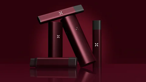
PAX, a leading global cannabis vaporizer brand, has unveiled The Oxblood Edit, an ultra-limited-edition collection designed to bring one of the season’s most distinctive colors to three of the company’s flagship devices. The new collection introduces a rich burgundy-inspired finish across the PAX FOUR, PAX MINI, and ERA GO, combining the brand’s established vaporizer designs with a bold aesthetic inspired by the changing visual landscape of fall.
With The Oxblood Edit, PAX is placing a greater emphasis on color and design as key elements of the consumer experience. The collection takes its name from the deep oxblood shade, a color that has become particularly prominent across fashion, interiors, and industrial design. Its dark burgundy character gives the devices a distinctive appearance while maintaining the sleek, contemporary look associated with the PAX lineup.
The limited-edition launch reflects a broader evolution in how personal consumer technology and lifestyle products are designed and presented. Rather than treating a vaporizer solely as a functional device, PAX has positioned The Oxblood Edit as a design-focused expression that can complement a user’s personal style.
The Oxblood Edit centers on a single defining visual element: a bold burgundy finish. The color is intended to capture the character of fall while giving the three participating PAX devices a more distinctive appearance.
Oxblood has become a recognizable design choice because of its ability to balance richness and sophistication. The deep red-brown tone can create a sense of warmth while remaining visually striking. PAX draws on those qualities to create a seasonal interpretation of its flagship products.
The company describes the collection as bold, distinctive, and designed to turn heads, emphasizing the visual impact of the new finish. Rather than introducing an entirely new device platform, PAX is using color and presentation to create a fresh interpretation of familiar products.
The approach allows the company to extend the appeal of its existing lineup while giving consumers another way to select a device based on personal aesthetic preferences.
The Oxblood Edit spans three products in the PAX portfolio: the PAX FOUR, PAX MINI, and ERA GO. Each device brings its own product format and characteristics to the limited-edition collection, while the new finish creates a consistent visual identity across the range.
The inclusion of the PAX FOUR gives the collection a presence among the brand’s flagship offerings. The PAX MINI brings the Oxblood aesthetic to a smaller-format member of the lineup, while the ERA GO extends the collection across another device platform.
By applying the same seasonal color concept to three different devices, PAX has created a collection that functions as a cohesive design statement rather than a single-product colorway.
The unified finish also allows consumers who are already familiar with PAX products to discover a new visual interpretation of the brand’s designs. For those approaching the lineup for the first time, The Oxblood Edit provides a clearly differentiated entry point.
The inspiration behind The Oxblood Edit extends beyond the traditional product category. PAX says the collection was inspired by fashion, interior design, and industrial design, three areas where color can play an important role in defining identity and visual appeal.
In fashion, deep burgundy and oxblood tones are frequently associated with autumn and cooler-season collections. Their darker character can offer an alternative to more conventional black, brown, or neutral shades while maintaining a refined appearance.
Interior design similarly uses rich colors to create visual depth and warmth. Oxblood can serve as an accent color or a central design element, depending on the setting. By drawing inspiration from interiors, PAX is connecting its product design with broader lifestyle aesthetics.
Industrial design provides another important influence. In this field, form, materials, finish, and color work together to shape how consumers perceive an object. The Oxblood Edit reflects that philosophy by treating the surface finish of the devices as an important part of the overall product experience.
The result is a collection that seeks to bridge technology and lifestyle design.
One of the central ideas behind The Oxblood Edit is visibility. PAX characterizes the collection as designed to turn heads, signaling that the color is intended to make the devices more visually prominent.
The deep burgundy finish provides an alternative to more understated device colors. It gives the three products a recognizable appearance while preserving the basic design language of the PAX lineup.
For consumers who view personal devices as part of their everyday accessories, appearance can be an important consideration. A device that is carried, stored, or used regularly can become an extension of personal taste, making color and finish relevant alongside functionality.
The Oxblood Edit addresses this design-oriented perspective by giving consumers an option that is intentionally expressive.
The ultra-limited-edition positioning is another defining aspect of the launch. Limited collections can create a sense of exclusivity by differentiating a particular product version from standard offerings.
For PAX, The Oxblood Edit provides an opportunity to introduce a seasonal expression without changing the identity of the broader product portfolio. The collection can stand apart as a special design release while the PAX FOUR, PAX MINI, and ERA GO continue to represent the company’s core device lineup.
The limited nature of the collection also contributes to its appeal among consumers who are interested in products that feel less common or more distinctive. Instead of simply choosing a standard finish, customers interested in The Oxblood Edit can opt for a version created specifically around a seasonal design concept.
This approach is increasingly relevant in consumer categories where design and individuality influence purchasing decisions.
The launch of The Oxblood Edit demonstrates how product design can extend beyond technical specifications. While performance and functionality remain fundamental to any consumer device, the physical appearance of a product can influence how it is perceived and how it fits into a consumer’s lifestyle.
PAX has built its brand around cannabis vaporizer products, but The Oxblood Edit highlights the company’s interest in the aesthetic dimension of those products as well. The collection places color at the center of the story, using the oxblood shade to create a visual connection with contemporary seasonal design.
This strategy can also help a product category participate in broader cultural and design conversations. By looking toward fashion, interiors, and industrial design, PAX is drawing inspiration from fields where seasonal color trends are already well established.
The resulting collection presents the vaporizer as an object that can be considered through the same visual lens as other lifestyle products.
The Oxblood Edit arrives as PAX refreshes the appearance of three established devices for the fall season. Instead of introducing an entirely new product category, the company has focused on creating a strong visual identity around existing flagship products.
The approach provides continuity for the brand while allowing it to experiment with a more expressive aesthetic. The burgundy finish gives the devices a new character without abandoning the recognizable PAX design language.
For existing PAX customers, the collection offers an opportunity to experience familiar products in a new finish. For consumers drawn to seasonal design, it introduces a visually distinctive alternative within the company’s portfolio.